McLaren’s new brand identity, unveiled ahead of the Azerbaijan Grand Prix, traces its wordmark back to a 1920s service station sign in Auckland rather than attempting a radical modern redesign.


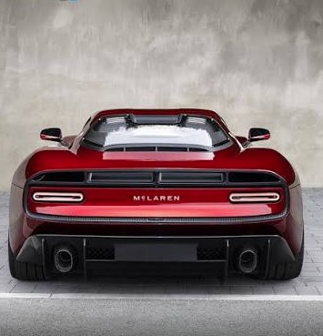
McLaren’s new brand identity, unveiled ahead of the Azerbaijan Grand Prix, traces its wordmark back to a 1920s service station sign in Auckland rather than attempting a radical modern redesign.
McLaren spent 2026 building toward a rebrand, and when it finally arrived on September 22, most people needed the press release to notice anything had changed at all. The wordmark got a new, lighter sans-serif font. The lowercase “c” picked up a small underline. The papaya orange stayed. The speedmark stayed. The Speedy Kiwi, McLaren’s nod to founder Bruce McLaren’s New Zealand roots, stayed too. By the standards of a corporate rebrand, this was less a transformation than a fine-tuning, and that restraint is precisely what makes it worth examining.
The story McLaren is telling about the change is a heritage story, not a modernization story. The new wordmark is drawn directly from the sign that once hung above the McLaren family’s service station in Remuera, Auckland, a garage Bruce McLaren’s parents, Les and Ruth, ran in the 1920s and where Bruce first modified a 1929 Austin Seven, the car that carried him to his first-ever race win at Muriwai Beach. Chief creative officer David Woodhouse framed the choice as continuity rather than reinvention, saying the rebrand “reconnects McLaren with its origins while giving the brand a confident visual language for the future.” It’s worth noting what McLaren chose not to do here. It didn’t invent a new geometric mark, didn’t chase a stripped-down minimalist aesthetic, and didn’t try to signal a technological pivot the way many automotive brands have in recent years. It went backward, deliberately, to a hand-painted sign from a century-old garage, and called that the future.
That decision looks considerably more calculated once it’s placed next to the industry’s most infamous recent counterexample. Jaguar’s 2024 rebrand, unveiled ahead of its Type 00 concept, jettisoned decades of brand equity for a stark, minimalist identity that drew instant and sustained backlash, widely cited across design commentary as a cautionary tale in what happens when a legacy brand tries to sever itself from its own history too abruptly. Design outlets covering McLaren’s announcement invoked Jaguar almost reflexively, treating it as the implicit benchmark for how badly a heritage rebrand can misfire. McLaren’s approach reads, in that context, less like timidity and more like a lesson learned by watching someone else absorb the cost of the alternative. Where Jaguar bet that customers wanted to be told who the brand was becoming, McLaren bet that customers wanted to be reminded of who the brand already was, just rendered a little more cleanly.
There’s a deeper structural reason for the timing, too. McLaren describes this rebrand as unifying its Racing and Automotive divisions under a single, connected visual system, a genuinely practical problem for a company operating simultaneously in Formula 1, IndyCar, the World Endurance Championship, and road car manufacturing, each with its own historical branding quirks accumulated over more than 60 years. Rolling out one wordmark across a Formula 1 livery, an IndyCar entry, a WEC Hypercar program launching in 2027, and a forthcoming performance SUV is a coordination problem as much as a creative one. Seen that way, the rebrand isn’t primarily a marketing gesture aimed at outsiders at all. It’s closer to internal infrastructure, a shared visual language built to scale across business units that had previously been drifting toward inconsistency simply through years of separate evolution.
The choice to root the identity in a literal, physical sign, one that design commentary has noted still exists today, converted into residential housing, rather than an abstracted symbol or a wholly invented mark, also says something about what heritage branding is currently trying to accomplish across the luxury and performance sectors more broadly. It isn’t simply nostalgia for nostalgia’s sake. It’s an attempt to anchor a brand’s authority in something that can’t be copied or fabricated by a newer competitor: a verifiable, specific, almost mundane point of origin. Plenty of car brands can claim racing pedigree in the abstract. Far fewer can point to an actual garage, with an actual sign, where an actual teenager built the actual car that started everything. That specificity is difficult for a newer luxury automotive brand, however well-funded, to manufacture retroactively, making it a durable asset worth leaning on rather than discarding.
None of this guarantees the rebrand lands the way McLaren hopes. Some Formula 1 commentary has already noted that the change is subtle enough that plenty of fans may not consciously register it at all, a risk that cuts the opposite direction from Jaguar’s problem: rather than alienating an audience with something too unfamiliar, McLaren risks spending real design and coordination resources on a shift few people outside the industry will ever notice happened. But that risk is arguably the more survivable one for a brand built primarily on performance credibility rather than fashion-forward reinvention. McLaren didn’t need its logo to go viral. It needed its logo to stop being a liability across a widening portfolio of racing series and road cars, without becoming a punchline in the process. On both counts, judged against the industry’s most recent cautionary tale, it appears to have succeeded by doing conspicuously less than expected, and doing it on purpose.

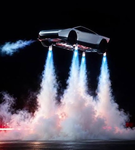
Tesla’s long-delayed Roadster performed a mid-air “kick flip” using compressed-air thrusters during a livestreamed unveiling at a SpaceX facility in Texas on Thursday.

The World Food Programme says escalating fighting in Yemen has cut life-saving assistance to about 800,000 people, most of them in Taiz, the country’s third-largest city.
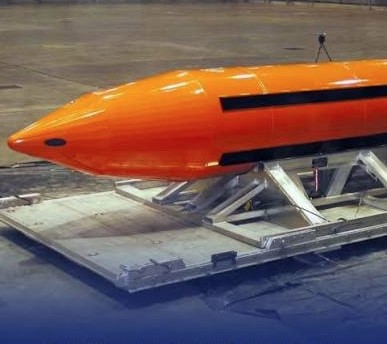
The GBU-43/B Massive Ordnance Air Blast bomb, the largest non-nuclear weapon in the US arsenal, is among the options reportedly drawn up for possible renewed strikes on Iran, according to CNN. The report has not been independently verified.
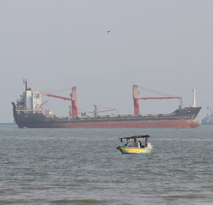
Iran’s Revolutionary Guard says a container ship carrying more than 2,500 containers sank near the Strait of Hormuz after hitting a naval mine, while shipping officials report two Singapore-registered vessels were hit by unknown projectiles.